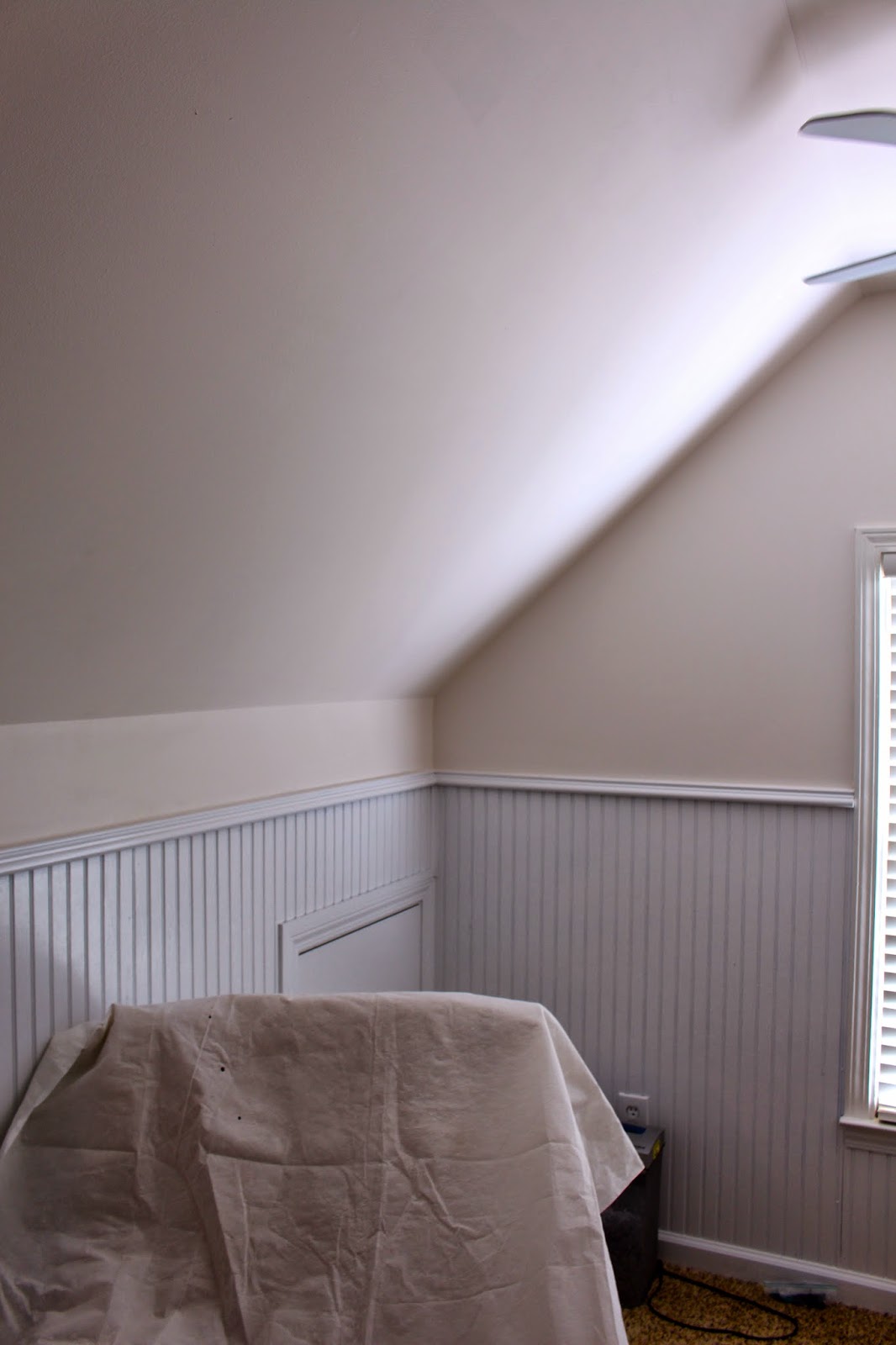
Last we spoke about this space, we had removed the bunk bed that was built in (and taking up a lot of space).
Seriously it's deceiving how much space this was taking up. So we removed it and it really opened up the room.
We were left with lots of unevenness in the sheetrock where the bed connected to the walls, some huge anchoring bolts sticking out of the wall that literally broke off as Brad removed pieces of the bed, and lots of paint to touch up.
So Brad sawed off the bolts with a Dremel tool and patched and sanded the walls. Only thing left to do was choose a paint color.
We thought about using the existing paint color (I was pretty sure I knew what it was), but the more I looked at it, the more I wasn't too thrilled with how yellow-beige it looked against all the stark white trim, especially since I'd be bringing in some pink tones to the room. I just thought it wouldn't look quite right. The issue with choosing a color was that it would have to be something that we could continue along the ceiling as well like the old color did. If we had just painted to the ceiling, the existing color on the ceiling would have really looked beige and out of place. The room has a pitched ceiling in certain places too, so I didn't want to just slap up some white paint on the ceiling and then do a stripe of color just on the walls above the bead board. I felt like it would be pretty choppy-looking.
So I knew we'd have to choose a shade that was a bit light and bright so it wouldn't look too enclosing continued all over the ceiling as well. Because of all the stark white trim in there on the bead board, it made it easier to pull off a lighter and brighter color without looking too plain because all the tones show up against the stark white.
Sounds a bit confusing, but stick with me...
So I chose a shade technically in the "white" color family, but with a lot of pink tones. The color is Marshmallow by Sherwin Williams.
This was taken when the paint was still a bit wet, so you can see a bit of it drying still on the ceiling.
I remembered this shade because I had considered it for our foyer but ultimately ruled it out because it read very pink compared to other whites with different tones. So I knew it would be pretty perfect for our gal's room. We really love how it came out.
This was Brad's first painting adventure solo. He did such an amazing job (and was so happy when it was all done).
Funny because if you painted this shade in a regular room with no stark white trim (like the large area of bead board on the wall) it wouldn't read as pink. I've seen photos of this color used throughout entire homes! It's just crazy how different whites can be. Anyone that has seen the nursery in person has commented on what a pretty soft pink it is.
While I'm no painting expert (and while Brad did amazing considering it was his first go-round doing a whole room by himself), we do have some tips to share (if you've followed for a while, you know I've painted almost every room in our homes). These were the main ones I passed on to Brad when he began painting the nursery:
- Don't waste money on plastic paint tray liners! Buy a metal paint tray once, and cover it with heavy duty aluminum foil before pouring paint in. Easy clean-up, and you can re-use the (clean) metal paint tray indefinitely.
- Skip painter's tape if you have a steady hand and go around all the trim, doorways, corners, ceiling, etc. with an angled brush first, then use a roller to fill-in. This is just the basic way to paint and it works. Saves time, tape, and your sanity. If you've ever taped-off an entire room, you know what I mean.
- When you use the roller, roll suuuuper sloooooow. Seriously ridiculously slow. Even if you don't think you're dripping anything, you'll leave tiny micro-splatters (totally a legit thing) all over the room and yourself.
- Drop cloths and broken-down cardboard boxes are your friend. You can lay out all your paint supplies on the flattened cardboard box and move it all around the room wherever you need it. And drop cloths... just use them to cover nice things you don't want to remove.
So the moral of this story is that we're really happy with the paint, and to also never overlook colors in the white family for rooms. They can be pretty perfect when you don't want the focus of a room to be the walls, but still want to complement the tones in the decor you're going to add. One in the perfect tone can change the whole feel of the room without being so "in your face".
So as I've mentioned in many of my pregnancy vlogs, the nursery has come a lot farther than this! While it's still kind of a mess (no super pretty after photos in this one, sorry!), there's a lot more progress to share like lighting, window treatments, the crib (!), etc. So I'll definitely keep you updated on our progress in the coming weeks!
As always, thank you all for being so happy for us and so supportive as we share this special time with you all. It's obviously a huge part of our life right now and we couldn't be happier to be experiencing all of it and being able to share it!


No comments:
Post a Comment