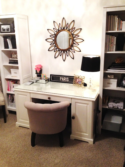
So in less than 24 hours, my home office went to this...
BRIGHT AND HAPPY :)
...from this.
dark and gloomy... and purple?
The only new items? Black curtains. That's IT. The paint was found in (what my husband calls), the "paint department" in our garage and all the furniture is the same, but rearranged. The lamp was in our attic. Shop what ya got, baby.
Ok, so I know it wasn't horrible before. The main issue was that the old office didn't make me feel good, which is what decorating and interior design is all about. I originally went with the dark gray because, well, I wanted a dark gray room. Why not the office?? Looking back, I love the color, but that shade wasn't what I wanted to work within during the day, you know? It was just too dark and gloomy in there. Grays are SO tricky. To me, that one looked very purple. So instead of my chic gray office, I saw a purple mistake every single time. So if you're ever in a gray-paint-choosing situation, make sure to take the purple/blue level into consideration and go for a more true gray.
Another issue with the old office? It was cramped. Rearranging the existing furniture in the room seriously made it feel like the space has tripled. It's insane. Don't get me wrong, I love a floating desk, but I like open space more.
Check out all the rolling around space! ...for Waylon I mean. It goes back several more feet to the opposite wall beyond the edge of the photo.
This is the only "stark" white room in our home, but it works. Don't think white is easy or boring. It actually takes more to make white work. My decor style usually is more neutral walls (warm grays or taupe) and accessorizing with color. Color for the sake of color is no bueno. You've got to have your own style and do what makes you feel good in your own home, always.
Anyway, this white is Vanilla Milkshake by Benjamin Moore in a semi-gloss finish, which I would usually avoid for walls. I always go with eggshell. But this works! Is it bad that when we moved in I forgot what exactly I even had this paint mixed for?? It's almost iridescent. The existing mini chandelier light fixture casts a mega glamorous glow against the finish.
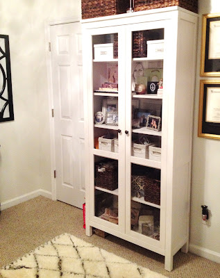
The biggest change other than the color is the furniture arrangement. I took my existing 3-piece book shelves/cabinet from the Ikea Hemnes line and divided those babies. I replaced the glass center cabinet with my Ikea Liatorp desk. I love the look of these three pieces together.
(the little striped pillow was a lucky Target clearance find, for $5!)
On the opposite wall, which in the original office was furniture-free, is now home to the center cabinet. I keep a lot of office/craft supplies in this big guy, as well as some cutesy trinkets and assorted tchotchkes. :) Bookshelf styling is my favorite. In the open shelves surrounding the desk, my favorite books, photo boxes, framed photos, and pretty knickknacks hang out.
The chair above is a random dining chair I picked up from Pier 1 on clearance a while back. The pillow is from Target and my little inspiration pin board was a super cheap-o find from Hobby Lobby that I covered with fabric. Super easy way to update a plain cork board, by the way.
Some more bookshelf styling...


gold urchin: Nate Berkus for Target (moved from our family room), black vase: clearance find from Target (only $5!) ... and also moved from our family room. When you redecorate, shop your house and use what ya got!
The desk itself is super fun because before, I didn't keep much on the desktop. I love that now, I can add more to it without looking cluttered since it's against the wall.
mirror: Home Decorators, mirrored tray: Target, jeweled calculator & Paris sign: Z. Gallerie, gold frame: Target, lamp shade: Target, lamp: (really old) from Home Goods
chevron print cups: Mikasa (from my matching dish set)
Again, use what ya got!
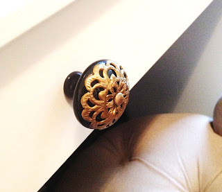
I replaced the boring knobs on the desk with these that used to be in a bathroom! I luckily had a whole drawer full of them. I believe they were originally from Anthropologie.
My light gray tufted chair I'm using at the desk was another lucky find from the Frontgate Outlet. It's super comfortable at the desk and just the right height.
The 95-inch curtains were an awesome find at Target. They were the ONLY thing I bought specifically for this office re-do. A huge tip for cheaper panel curtains... You can easily make them look super expensive by adding some clip rings to the back side of the top and hanging them that way. Makes the fabric hang nicer rather than using the pre-sewn pole pocket at the top which never looks good. I chose an antiqued brass (which I had in a bag in our attic, leftover from our old place), to go with the gold/brass accents in the room.
So that's it guys! I hope you like it. I am in LOOOOVE with it. It feels so good to be blogging from a place I feel good in and really love. That's all that matters in interior design.... what makes YOU feel good and what you love. It's all about what speaks to you.
So if something isn't quite right in a room in your home, don't spend a ton to re-do it! Use what you've got and be a little creative. You can get a dramatic result on a budget using stuff you already have and doing a quick furniture switch-a-roo. ;)
Would you guys eventually like to see a video tour on my vlog channel when it's completely done?
Have you guys re-decorated lately??


No comments:
Post a Comment