Back in November I posted swatches of one of my MAC Pro Palettes and you can read that post here. I have finally gotten round to writing up my post about my second Mac Pro Palette.
I hope this gives you some inspiration next time you're at the Mac counter!
SUMPTUOUS OLIVE is one of my all time favourite shades and finishes (veluxe pearl). It's one of those magical duochrome shades that love the light to bring it to its full beautiful glory. A golden khaki-warm in tone and most used by me all over the lid with Wookwinked in the crease.
SHALE is the most gorgeous cool toned mauve with very very subtle silver sparkle. One of the less pigmented shades and a great one for beginners
HANDWRITTEN is a matte chocolate brown, fairly warm in tone. Great for definition in the crease.
TWINKS pairs well with Handwritten for a brown toned smoky eye. It is another from the veluxe pearl range and is a warm golden brown with red microshimmer and a hint of plum
PATINA is one of Mac's most popular shades. A great all rounder and a great 'My first MAC shadow'. Patina is kind of a light golden brown with almost an apricot hue to it when swatched. It's quite a unique but very versatile colour. When I am swatching it again today it looks more rose/old gold in the sunlight than my swatch above. Definitely one to check out.
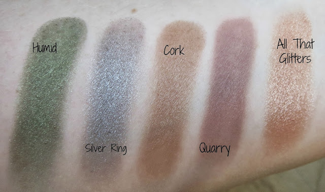
HUMID is a medium green with gold microshimmer.
SILVER RING is a relatively sheer medium silver grey. It works well with Mac Carbon for a smoky eye or even with Mac Soft Brown though the crease for a more daytime look.
CORK is medium warm toned brown with a satin finish. I don't find this colour to be massively pigmented and it can be a little bit difficult to work with.
QUARRY is a matte plum brown, perfect for adding subtle definition in the crease. Try paring it with Patina. I personally find the matte shades harder to blend from Mac than the other formulas but the pigmentation on this one is good.
ALL THAT GLITTERS is another one of Mac's most popular shades. Peach in tone with a frost finish-the beauty of this shade is it's versatility. It looks great paired with browns, bronzes, purples, taupes and golds. It's probably too peach for me to wear on it's own but makes a great base shadow to be paired with darker colours.
CONTRAST is a very pigmented blackened navy with a pearl finish and blue microshimmer. It's so beautiful. The pigmentation is very even too when applied. A great alternative to black and if you have light blue eyes you MUST buy this colour.
SATELLITE DREAMS is a stunning purple with magenta undertones. It blends best with golds and browns. I found this beautiful look using Satellite Dreams and Shale.
CONCRETE is a cool toned dark brown but with a grey undertone. One that can be used as a eyebrow colour as it is relatively matte.
COQUETTE is a matte medium brown, I mostly use it for crease work. Not too warm or cool toned so a good choice for everyone.
NAKED LUNCH is an eyeshadow I have repurchased several times. An excellent base colour, foolproof in application, akin to Stila 'Kitten' but with a much finer, lighter texture and because of that, doesn't quite pack the punch of pigmentation Kitten does (my all time favourite eyeshadow btw). It's the perfect champagne peachy pink.
All of these shadows are from the permanent line. Do you own any?
I have just taken photos to show you my third Mac Pro Palette so watch this space.


No comments:
Post a Comment